
This article delves deeper into Consumer Theory and touches upon topics like Income Shits, Engel Curves etc.
Before you start, I would suggest reading the first part of this article, which contains the basic ideas of Consumer Theory like Indifference Curves, Budget Constraints, etc. In this article, we’ll discuss a few more topics of interest (Demand Curves, Income Shifts) and, hopefully, end our discussion on Consumer Theory.
Demand Curve
Before we start with our current topic, let’s recap some variables and inputs we used last time. They were —
Y = Income/Budget
Pa = Price of each apple
Pb = Price of each banana
A = Quantity of apples.
B = Quantity of bananas.
Now I think we are good to go:
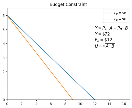
Imagine this, the price of bananas has increased from $6 to $8, but your income remains the same. What will happen to your budget constraint?
Simple right?
Let’s plot the Utility functions as well and get the Optimal Constrained Choices for both cases.

Looking at the plot, we can say that earlier, when Pb was less, our optimal number of bananas was more than the latter. Well, we can also say that when Pb increased, our demand for bananas decreased.
Extrapolating this line of thought, let’s take some values of Pb and plot the optimal number of bananas to be brought using the same Utility function.
Here are the values —
Pb = $12, $6, $3
Pa = $12
Now let’s do one more exercise, plot these values of Pb with B. Here’s what it looks like.

What do you think it is? Well, we’ve just plotted the Demand Curve for bananas. And as you can observe, when Pb increases, B decreases, resonating with our intuition that when price increases, demand falls.
But an important thing to remember is that the demand for apples is not affected at all when Pb changes, which might not be accurate for real-world applications but works for our understanding.
Elasticity of Demand
Now that we have derived the Demand Curve let’s break it down and experiment with it.
One of the most significant things to notice is its slope. As you might have noticed, the slope of the demand curve in our example is always negative. What does it mean? Well, it simply means — when the price increases, demand falls. Intuitive right?
We define the slope as the Elasticity of Demand with the symbol epsilon and, mathematically, can be defined as —

Now, to grab a more intuitive feel of Elasticity, let us cook up some extreme cases and imagine their consequences.
Case 1: Elasticity = 0
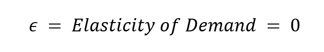

What does it mean? Well, if you look at it closely, you’ll see that the quantity demanded will remain the same irrespective of the price. Didn’t get me? observe the plot carefully….
That’s stupid, right? how can the demand be the same when the price increases? Well, it turns out that there are some products whose market mimics this phenomenon to some degree. For example, Insulin, small price changes won’t affect Insulin’s market at all because of its overarching importance and influence in today’s consumerist economy. Similarly, some unique patented products and life-saving medications also follow a similar pattern.
These products have no plausible substitute.
Case 2: Elasticity = -infinity


Well, what do make of it now?…..I’ll answer that for you if you can’t.
In this case, the competition is so high that a small price change will make the demand 0, as there is always a perfect substitution.
Simple right?
Now let’s move on to one of the last yet probably the most crucial topic of this article.

Income Shifts
Imagine this, how much does your Optimal Choice of any particular combination depend upon your income? Well, a lot right, because Optimal Choice is plotted on the budget constraint, and the budget constraint is dictated by the income (Y).

Now we know Utility is -
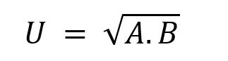
and we want to maximize the Utility as much as possible for any combination of products.
Now using these above relations, let us plot the Optimal Choices but with different Incomes. Refer to the plot for a better grasp.

This plot is known as an Engel Curve — It gives us the variation of different Optimal Choices we are to make when Income shifts.
Now let’s break it down into simple parts — Plot the Income with the corresponding bananas to be chosen.
We’ll notice it is similar to a straight line with a slope (symbol: delta) —

The slope is known as the Income Elasticity of Demand.
The slope for most goods is greater than 0.
 |
|---|
| ‘Most goods’ do not mean all goods. |
What does the last sentence signify? Intuitively it simply means that when your income increases, you are more likely to buy more of that product. Makes sense, right?
But that’s not the case with most of the products. Imagine fast food; think about it, Rich people do not go to Mcdonald’s. They are more likely to go to an expensive restaurant rather than spend more on McDonald’s. Therefore, for this case —
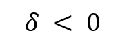
These kinds of goods are known as Inferior goods.
Another example could be potatoes.
Now lets us talk about the case where the slope is greater than 0.
In our pursuit, we find that 2 possible cases can arise:
Case 1: slope < 1

In this case, it means that you are spending less proportion of your income rise in the product. Think about it.
An example could be — Household necessities; the richer you get, does not make you increase your spending on household necessities, or at least in proportion to your income.
In other words, a smaller share of your income is spent on these products. For example, food and necessities.
Case 2: delta > 1

Intuitively, it means that a higher proportion of your income is spent on these products. Example? Well, we already know. Expensive houses, boats, cars, and luxury watches all fall into this category. To generalize, all luxury products have a delta > 1.
Again, in other words, a higher proportion of your income is spent on these products.
Effects of Price Change
Ok…Now coming to the most crucial topic. A topic that will require the culmination of all that was discussed in the past articles.
Before we start, I’ll list out some formulas and a very important plot, which we will then discuss in great detail.


Ok…let us come to the plot cause the formulas are no fun!
Here 2 straight lines (blue and orange) signify that the price of bananas has changed, and so has the slope of the line (MRT). If P1 was the initial optimal choice considering the original price and P3 as the final point. But something really strange happens during the transition from P1 to P3.
Two things change between the original and the final budget constraint. One is the x-intercept because the price changes, and hence, you can buy less of the product (Income Effect). The second is the slope (MRT). Since the price has increased only for bananas, the relative value of bananas with respect to apples has changed (Substitution Effect).
Think about it in a series of discrete timesteps. At t=0, you are at P1. When the price of bananas changes, you don’t immediately proceed to P3, with a lower Utility value, but first, to P2, where you sacrificed some bananas to match the new slope of the budget constraint or, in other words, match the new relative value of bananas and apples (green line). This is known as the Compensated Demand. We increased the price. Hence the relative value for apples and bananas is now adjusted. Also, in our hypothetical universe, apples and bananas are the only products we can buy with our income. Observe P2 is still in the same Indifference Curve, meaning the happiness level is still the same. This is the Substitution Effect.
Now, you cannot maintain your place at P2, can you? Well, because it does not fall under your new budget constraint (orange line). Therefore, from P2, you come to P3, such it is parallel to the new budget constraint. You have effectively become poorer. This is the Income Effect.
If you weren’t able to grasp the complete idea, do read and observe the plot again. Personally, it took a lot of time to wrap my head around this idea.
Observe that both the Income Effect and Substitution Effect, i.e., shift the points inward towards the origin. This is expected as the price of bananas increases; you are supposed to consume fewer bananas.
But there are some exciting examples where Substitution Effects and Income Effects act in opposite directions. A good example would be Potatoes — Look at the plot below:

This plot is strictly for visualization purposes only.
In this plot -
S - Steak
P - Potatoes
This plot is strictly for visualization purposes only.
Here, the Substitution Effect took from P1 to P2, but Income Effect tended to bring it back to P3. Simply put, Substitution Effect did change the relative value of potatoes in comparison to steak as the price of steak changed, but Income Effect suggested as your income increases, you are more likely to purchase fewer potatoes and more steak, which is exactly accurate as the delta for potatoes as said earlier, is less than 0.
Of course, the above example cannot be plotted using our Utility function and budget constraints, but the main purpose of this example was to suggest the significance that rising incomes do not mean proportionate spending on all products.
The table below summarizes the idea:


Imagine if the Total Effect > 0 when the Price change> 0. Well, it simply means that when the price increases, your demand increases as well!….Is it possible? Well, it’s pretty hard to find such examples, and this phenomenon is hence called the ‘Giffen Good.’
Conclusion
And that’s it from my side on Consumer Theory. I am pretty sure these articles are not enough at all to grasp the complete idea of Consumer Theory but might be enough to get an overview of the same.
Thanks for reading!